NextJS Images: 9 Best Practices To Optimize Images With NextJS (2023)
Images represent more than 60% of a web page on average, according to Google: their impact on your user experience is tremendous! Unoptimized images can easily destroy a website’s performance, making it unusable for the average user on a slow mobile Internet connection.
One of the first thing we do at JAMstack Consulting to improve a website’s performance is to optimize its images, so we know exactly how important it is to get it right. Read on to get our checklist and tools we use to drive our process with automated data reports.
Why You Need Optimized Images
Optimized images give your website three main benefits:
- Faster speed - Large images slow down the loading time of a website, resulting in poor user experience. Optimizing images reduce file size, which reduces the amount of time it takes for them to load.
- Lower costs - Downloading large images consumes a lot of bandwidth. Reducing your bandwidth consumption means decreasing hosting costs while increasing your scaling performance. On most websites, images weigh more than the actual content!
- Less manual processing - Unoptimized images require manual editing to resize and compress. This can be time-consuming and may require technical skills that not everyone has. With the right optimization process, you can automate these tasks and reduce the amount of manual editing required.
Fortunately, NextJS comes with great tooling to help you optimize images: you just need to know where to look, and that’s what we’re here for!
9 Best Practices To Use Images With Nextjs
1. Use The Right Image Format
Different image formats have different characteristics and properties that affect factors such as image quality, file size, and loading speed:
- JPEG is good for photographs and complex images with many colors because they use lossy compression to reduce the file size while preserving the quality of the image.
- PNG is great for transparent pictures. It uses lossless compression to preserve the quality of the image but results in larger file sizes.
- WebP uses both lossy and lossless compression techniques to reduce file size while maintaining image quality. WebP’s lossless images are 26% smaller than PNGs, and 25-34% smaller than comparable JPEGs. The format is supported by all major web browsers, including Google Chrome, Mozilla Firefox, and Microsoft Edge.
As a rule of thumb, it’s advised to use WebP as your default image format. Using the wrong format can result in slower page load times, lower-quality images, and a suboptimal user experience. AVIF is another option, but not as widespread as WEBP.
By default, NextJS is configured to convert all images to webp, so you don’t need to do anything special:
module.exports = {
  images: {
    formats: ['image/webp'],
  },
}
Last but not least, replace GIFs with videos. Videos are always more optimized than animated picture formats, you just need to set the video attributes to replicate GIF’s properties to play automatically and silently in a loop:
<video autoplay loop muted playsinline></video>
2. Reduce Image Dimensions
The lower the resolution without significant quality loss, the better. But how low is too low? Because of the variety of devices and screen resolutions, it’s often too complex to figure out which image dimension is the best. Instead, prefer responsive image sizes.
NextJS provides the sizes attribute to dynamically generate different images for different screen resolutions using the next/image library:
import Image from 'next/image'

<Image
    src="/example.png"
    fill
    sizes="(max-width: 768px) 100vw,
            (max-width: 1200px) 50vw,
            33vw"
/>
Alternatively, you can also stick to a single image size using the width and height attributes and let the browser handles resizing, provided that you know the exact dimensions of the image.
3. Leverage Lazy-loading
When a web page is first loaded, all images are typically loaded at once, slowing down the main thread. With lazy loading, images are only loaded when the user scrolls down to the part of the page where the image is located, so that only the images that the user is actually viewing are loaded.
Lazy loading images significantly reduces the page's loading time. It also helps reduce data usage, which is particularly important for users on mobile devices with limited data plans.
NextJS lazy loads image components by default, so you don’t need to do anything special.
It is advised to disable lazy-loading for images above the fold, though. To do this, you can set the loading priority higher, or switch to eager loading:
<Image
  src="/example.png"
  loading="eager"
  priority={true}
/>
4. Don’t Forget Accessibility
Image accessibility ensures that people with disabilities like visual impairments can understand the content of images on websites.
People with low vision often use assistive technologies like screen readers to navigate websites. These technologies rely on brief image descriptions, called alt text, to convey the content of the image to the user. Without alt text, a screen reader may simply skip over the image, leaving the user confused if the illustration is necessary to understand the textual content. In many countries, including the United States, accessibility is required by law if you own a public website. Failure to do so can result in legal action.
For decorative images that don’t hold any information, use a null alt text, role="presentation", role="none", or aria-hidden=”true”:
<Image src="example.png" alt="" role="presentation"/>
For informative and functional images, simply always specify an alt text:
<Image src="example.png" alt="a cat playing with a plastic ball"/>
For SVG graphics, use role=img with a title tag:
<svg role="img" aria-labelledby="title">
  <title id="title">A cat playing with a plastic ball</title>
  ...
</svg>
For complex images, use a figure with aria-describedby:
<figure aria-describedby="description">
  <Image src="example.png" alt="a cat playing with a plastic ball"/>
  <figcaption id="description">A cat playing with a plastic ball</figcaption>
</figure>
Additionally, it’s important to write correct alt text. Avoid using words like "image of" or "photo of" in alt text, as screen readers identify file types for you. And write alternative text like it’s meant to be read by a human: no keyword list, weird characters, or long, monotonous sentences.
Let’s see how to check if your website is accessible or not in the next section.
5. Measure Image Performance
Web dev tools like Google’s Lighthouse or Page Speed give you precious information regarding your core vitals and how to improve your website’s images. Instead of manually checking all your images, you can use these tools to tell you what’s wrong in your website.
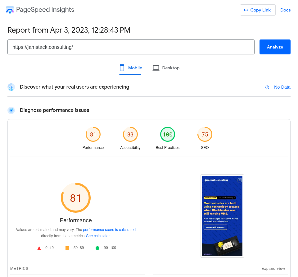
Common performance flags for images include:
- Eliminate render-blocking resources
- Properly size images
- Defer offscreen images
- Efficiently encode images
- Serve images in modern formats
- Use video formats for animated content
These warnings will help you find unoptimized images on your website and implement the best practices in this article, so pay attention to them.
6. Generate Social Cards
Not having a social card on a public webpage is a bad practice for SEO because a link to it won’t load correctly when shared, resulting in fewer clicks and traffic to your website. To prevent that, you can use Vercel’s @vercel/og library to compute and generate social card images using Vercel Edge Functions:
import { ImageResponse } from '@vercel/og';

export const config = {
  runtime: 'edge',
};

export default function () {
  return new ImageResponse(
    (
      <div
        style={{
          fontSize: 128,
          background: 'white',
          width: '100%',
          height: '100%',
          display: 'flex',
          textAlign: 'center',
          alignItems: 'center',
          justifyContent: 'center',
        }}
      >
        Hello world!
      </div>
    ),
    {
      width: 1200,
      height: 600,
    },
  );
}
If you aren’t hosting your website on Vercel, @vercel/og wraps satori, a library to convert HTML and CSS to SVG you can use in the browser, Node.js, and Web Workers.
7. Get Help From The Network
Using a Content Delivery Network (CDN) like Cloudflare or Vercel’s Edge improves image performance. A CDN is a network of servers distributed across different geographical locations used to deliver content to people based on their geographic location. When images are stored on a CDN, they are served to users from the server closest to them, reducing the time it takes for the image to load.
A CDN also helps reduce traffic load, which can improve website stability and prevent crashes during high-traffic periods. It offloads the task of delivering images to users, freeing up server resources to handle other tasks. CDNs also come with their caching and image optimization features.
NextJS also has its own caching algorithm. Image caching involves temporarily storing images in a user's browser cache so that they can be quickly retrieved and displayed the next time the user visits the website, reducing the amount of transferred data.
8. Switch To SVG Whenever Possible
Scalable Vector Graphics (SVG) is a popular image format that is widely used on the web because it offers many advantages over traditional image formats such as JPEG, PNG, and GIF
It’s an XML-based format that uses vector graphics to represent images, which means that the images can be scaled up or down without losing quality, making it ideal for various display sizes. Its small file size also allows for faster loading times and better accessibility for people with visual impairments who can resize the image without any quality loss.
SVG is best used when images need to be scaled up and down―for icons, logos, charts, etc. But as a rule of thumb, any image that can be vectorized should be to maximize both image quality and speed.
9. Use Image Placeholders
Image placeholders are temporary images displayed in place of the actual image until it has finished loading. They provide visual feedback to users to reduce frustration and confusion caused by slow loading or missing images. Slow-loading images or missing images can cause users to leave a website before it has fully loaded, leading to a high bounce rate.
You can use next/image to create custom placeholders matching your website’s design, or just load low-resolution thumbnail until the high-res image is ready:
<Image
    src="/me.png"
    alt="Picture of the author"
    width={500}
    height={500}
    placeholder="blur"
/>
Hire JAMStack Consulting
NextJS helps a lot to optimize images if you know where to look, but it's always a time-consuming process to get right, especially during your content creation process. The return-on-investment is huge, though, so it's worth the effort. If you prefer to focus on your core business or don't have the technical know-how, get in touch with us to implement these best practices. We're NextJS experts and we can help you generate fast images and automate your process.